One of my most popular blog posts is this early one on Creating Figures for Your Manuscript. I’ve been told again and again how useful this information is. So I thought it was time to re-post it. Enjoy!
“A picture is worth a thousand words.” Perhaps. A good figure in a medical journal will save at least 200 to 300 words of text in the Results, and probably some text in the Discussion as well. That’s worth a lot, with today’s strict word length limitations imposed by journals. Also, many readers only read the abstract, review the figures, and skim the discussion. It’s important your figure can stand alone and be fully explanatory.
How to create a figure that shows the results accurately, readily makes your point(s), is clear and legible in print, and is easily interpreted and understood by the reader? Now there’s the challenge.
For the first two items – show the results accurately and readily make your point(s) – you are the expert. You’ve doubtless read dozens (hundreds?) of papers in your specialty, describing similar types of results. You already know which results are commonly reported as images, and the types of figures used – radiographs, bar graphs, survivorship curves, box and whisker plots, etc. Which of your results are demonstrated most convincingly with an image? Which of your results may be excessively wordy or unwieldy if reported only as text? Convert these to a figure or table. Use your statistics program, Excel, or a dedicated imaging program such as Adobe Creative Suite to create your images. A quick online search will produce YouTube videos and step-by-step instructions for creating just about any kind of image with these programs.
Each journal publishes their figure requirements in the “Instructions to Authors.” Follow these carefully to ensure your figure translates well into print. A figure that doesn’t meet the journal’s requirements may lead to immediate rejection of your submission, without review. Figures usually must be submitted as separate files and in a TIFF or EPS format. Common figure requirements include a minimum resolution of 300 dpi for satisfactory print quality, and a minimum width of 3.25 inches (8.3 cm, i.e., one column width) and maximum width of 7 inches (17.8 cm, i.e., full page width) at this resolution. Height is usually restricted to maximum 7 inches as well. Design your image to fit well at one of these widths. Remember, the journal may choose to reduce a submitted 7-inch wide image to fit within a single column. Ensure any text in a figure you’ve designed to be 7 inches wide is still legible when reduced to 3.25 inches wide. Crop any white space around the outside of your figure to an absolute minimum.
Aim to create your figure in black & white. Use different types of shading and grey tones in bars; create lines as solid, dashes, dots, mix of dashes and dots, etc. Many journals permit colour images for their online PDF versions, but automatically convert images to black and white for the print copy. They may charge hefty fees ($750 or more per figure) to print colour images. If you must use colour, keep in mind that some readers are colour-blind, so avoid using red-green or blue-yellow combinations. Avoid using yellow, unless it is directly adjacent to a dark colour for strong contrast.
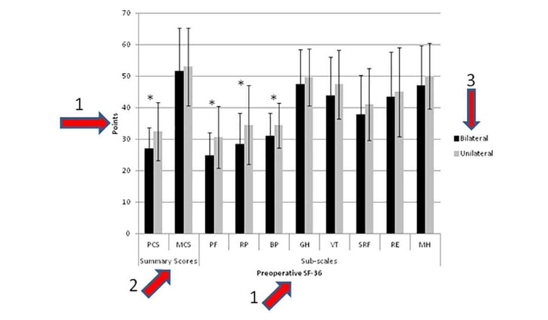
On graphs, make sure all axes are labelled (arrow 1), and the units of measurement are shown. Also label sub-groups if using multiple layers of analyses (arrow 2). Each shading/colour or line should be defined in a within-figure legend, i.e., a small box within the figure (arrow 3). If using acronyms, ensure they are defined in the text of the figure caption. In a multi-part figure, label each image (a, b, c, d) in the bottom left corner (arrow 4), with all labels the same colour, and ensure that the white space between images is a consistent size and kept to a minimum (arrow 5).

When you have your “final” image ready, print it out in black and white and at both widths. Have someone unfamiliar with your research review the figure (with its figure caption), to ensure the information is self-explanatory and complete and that your point is obvious.
Hoping you’ll find these suggestions helpful as you prepare your next figures for publication. If you still find the task of preparing manuscript figures daunting, my team can help.
I’d appreciate your feedback on this week’s tip and welcome suggestions for future weekly writing tips.
Next week we’ll explore how to write figure captions.
Update: It’s important that your figure looks good in black and white. A Twitter poll I conducted showed that, while people prefer colour figures in papers, they print out PDFs in black and white. So when they finally get around to reading your paper, it will be in black and white.
Did you enjoy this post? Want to make sure you never miss another blog? Then sign up to receive email notices whenever a new blog is posted under “Stay Up To Date!” at the top right of this page. Your email address is safeguarded and won’t be used for any other purpose.
Recent Comments